Funnel charts are an excellent way to visualize data that represents a process involving multiple steps, where the amount of data is reduced at each step. For example, a sales pipeline might begin with the number of users who visited your organization's website, and end with the number of users who bought a product.
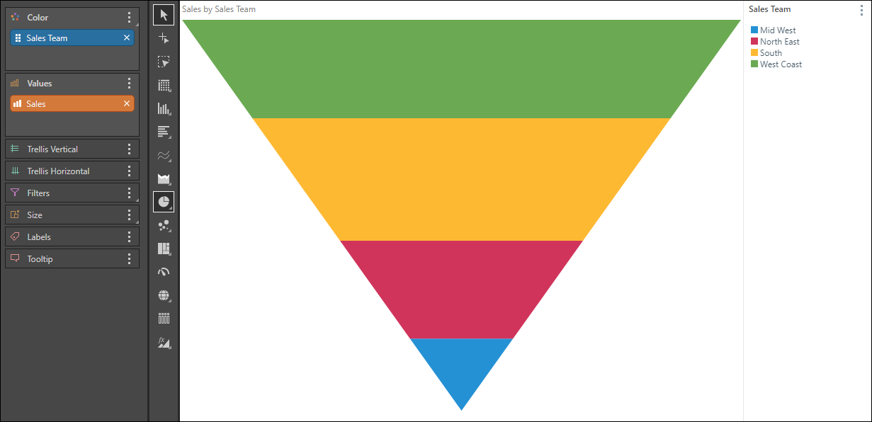
You can also use it as an alternative to a pyramid chard when you want the largest segment to be located at the top. For instance, in the example below we see Sales by Sales Team. It makes sense to visualize this as a funnel, as a funnel shows the most successful team at the top.
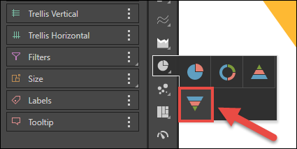
Build a Funnel Chart
Like pie charts, doughnut charts represent each category as a proportion of a whole. The member hierarchy in the Color drop zone drives the color of the segments, with each segment representing an element from the given hierarchy. The measure in the Values zone drives the size of the segments.